Color and Strokes
Penpot has a variety of styling options for each layer. When selected, the styling options are displayed in the design panel on the right.
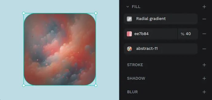
Color fills
Color fills can be added to boards, shapes, texts and groups of layers.
You can add as fills:
- Custom colors (hex).
- Color assets.
- Images.
To apply a fill you can use: the color picker, the color palette or a color style.
- The color picker.
- The color palette.
- The assets library.
You can also set the opacity for custom fill colors.
TIP: Select an element and press numbers from 0 to 9 to set their fill opacity. 1 to get 10%, 2 to get 20% and so on. You can set precise opacity by pressing two numbers consecutively in less than a second (for example 5 and 4 to set 54% opacity).
You can add as many fills as you want to the same layer. This opens endless graphic possibilities like combining gradients and blending modes in the same element to create unique visual effects.
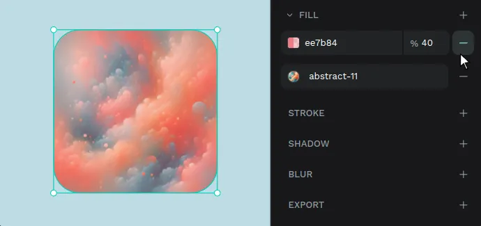
Remove a fill
To remove a fill from a selected layer, press the “-” button in the fill section.
Color picker
Here you have the anatomy of the color picker:
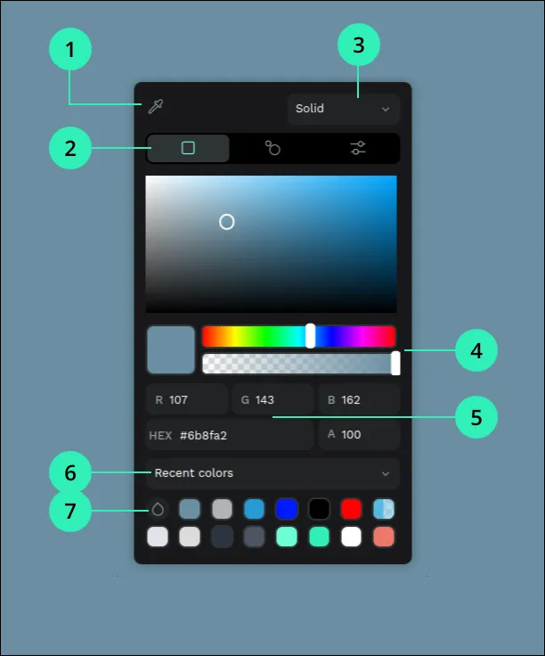
- Eyedropper - Allows you to pick any color of the layers at the viewport.
- Color profiles - Select between RGB, the Harmony Wheel or HSV.
- Color type - Solid, gradient, or image.
- Sliders - Easily manage settings like brightness, saturation or opacity.
- Values - Set precise color values of red(R), green(G), blue(B) and transparency(A).
- Libraries - Switch between recent colors and libraries.
- Color palette - A quick launcher of the palette with the selected library.
Gradients
You can apply gradient fills to layers. To do that select the Gradient type at the color picker.
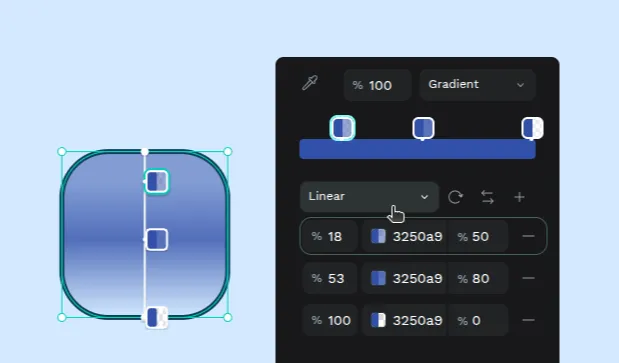
You can choose between two types of gradients:
- Linear Gradient: A smooth transition between two or more colors along a straight line, with the option to adjust the angle.
- Radial Gradient: A circular color transition that starts with one color at the center and gradually shifts to another at the edges, which could be a different color or a fade to transparency.
Color palette
The color palette allows you to have a selected color library in plain sight.
There are three ways to show/hide the color palette:
- From the main menu at the top left navbar.
- Pressing the color palette button the toolbar.
- Using the color palette launcher at the color picker (see previous section).
Use the menu to easily switch between libraries.
Switch between big and small thumbnails sizes.
Applying color from the palette
- Apply color to fill: Just select the shape and click on the preferred bullet in the color palette.
- Apply color to stroke: Press Alt (or ⌥ in mac OS) while clicking.
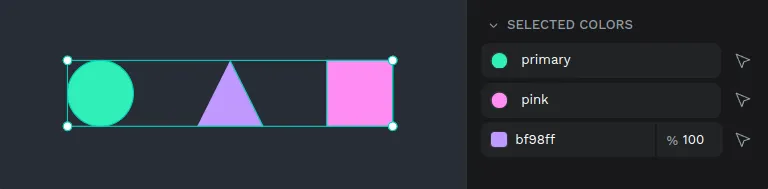
Selected colors
All of the colors that are contained within a selection of layers are showcased at the sidebar so you can play with the colors of a group without the hassles of individual selection.
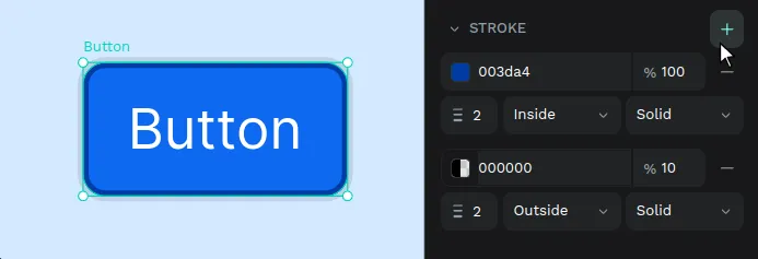
Strokes
Strokes can be added to most of the layers at Penpot (rectangles, ellipses, boards, curves and images).
Stroke options are:
- Color and opacity
- Width (in pixels)
- Position - center, outside, inside
- Style - solid, dotted, dashed, mixed
You can add as many strokes as you want to the same layer.
Stroke Caps
Ever needed an arrow to point something? You can style the ends of any open paths selecting different styles for each end of an open path.
The stroke caps options are:
- Line arrow - A simple line arrow (two lines at 45º) with the same width as the stroke.
- Triangle arrow - A solid arrowhead with the shape of a triangle.
- Square marker
- Circle marker
- Diamond marker
- Round - Adds a round ending to the end of the path.
- Square - Adds a rectangular ending to the end of the path.